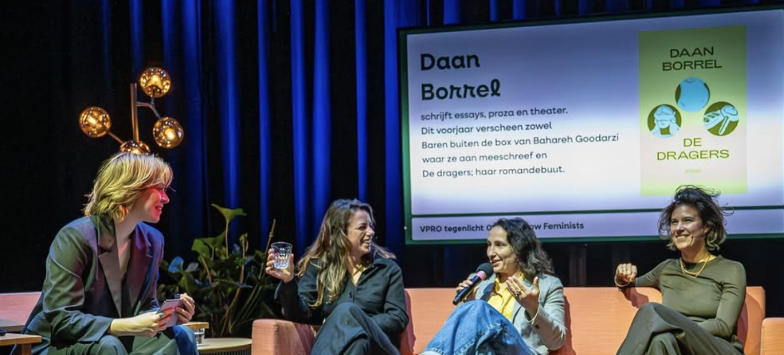
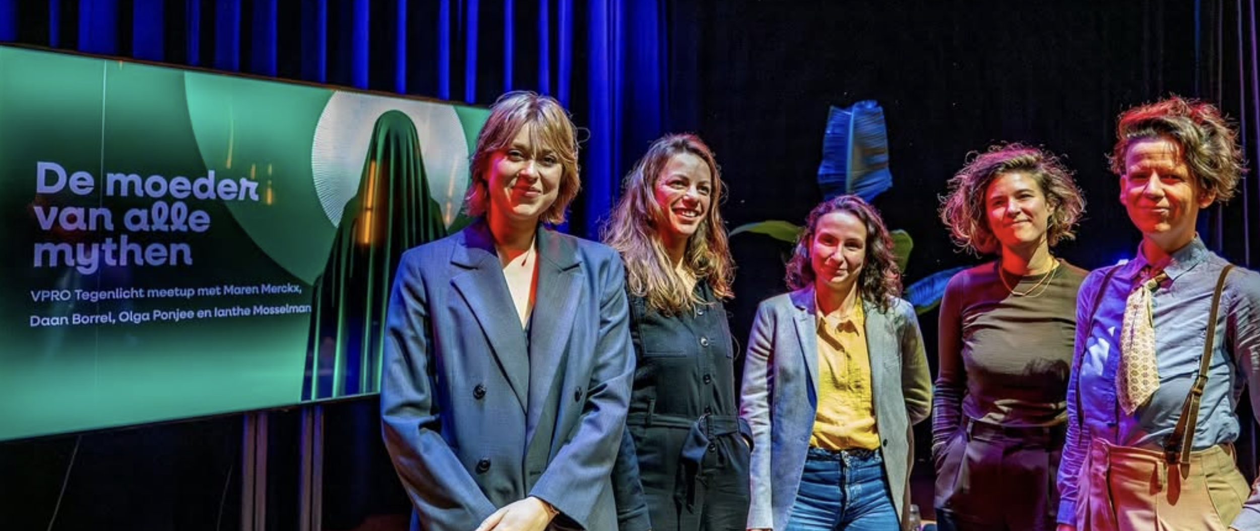
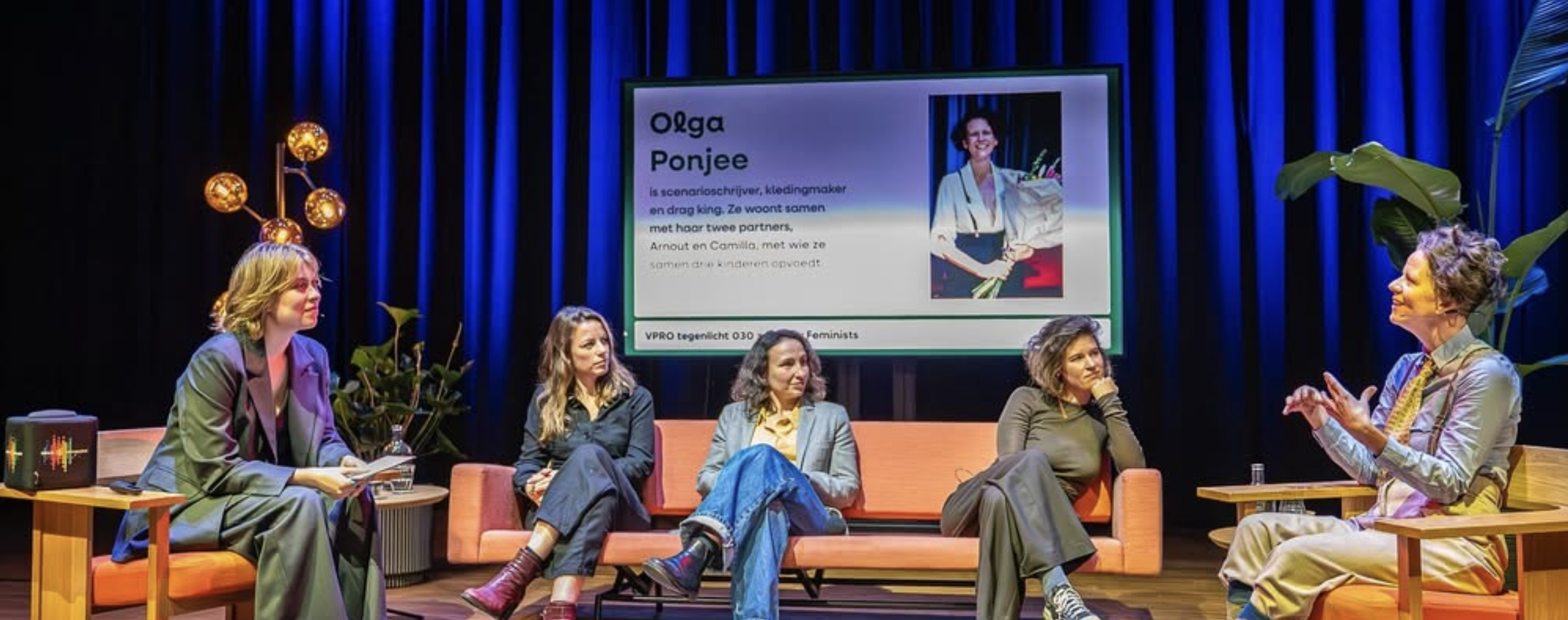
Fellow Feminists is a grassroots initiative in Utrecht that organizes monthly meetups where people discuss feminism and gender equality in an open, participatory setting. The gatherings began after a local Instagram call-out and are now often held at venues like Bibliotheek Neude. Discussions focus on themes such as everyday sexism, representation, and social justice, with a strong emphasis on intersectionality, exploring how gender inequality connects with factors like race, class, and sexuality. The events are informal and open to anyone interested in feminist dialogue.
COLORS
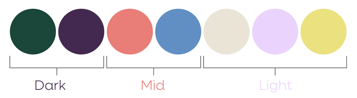
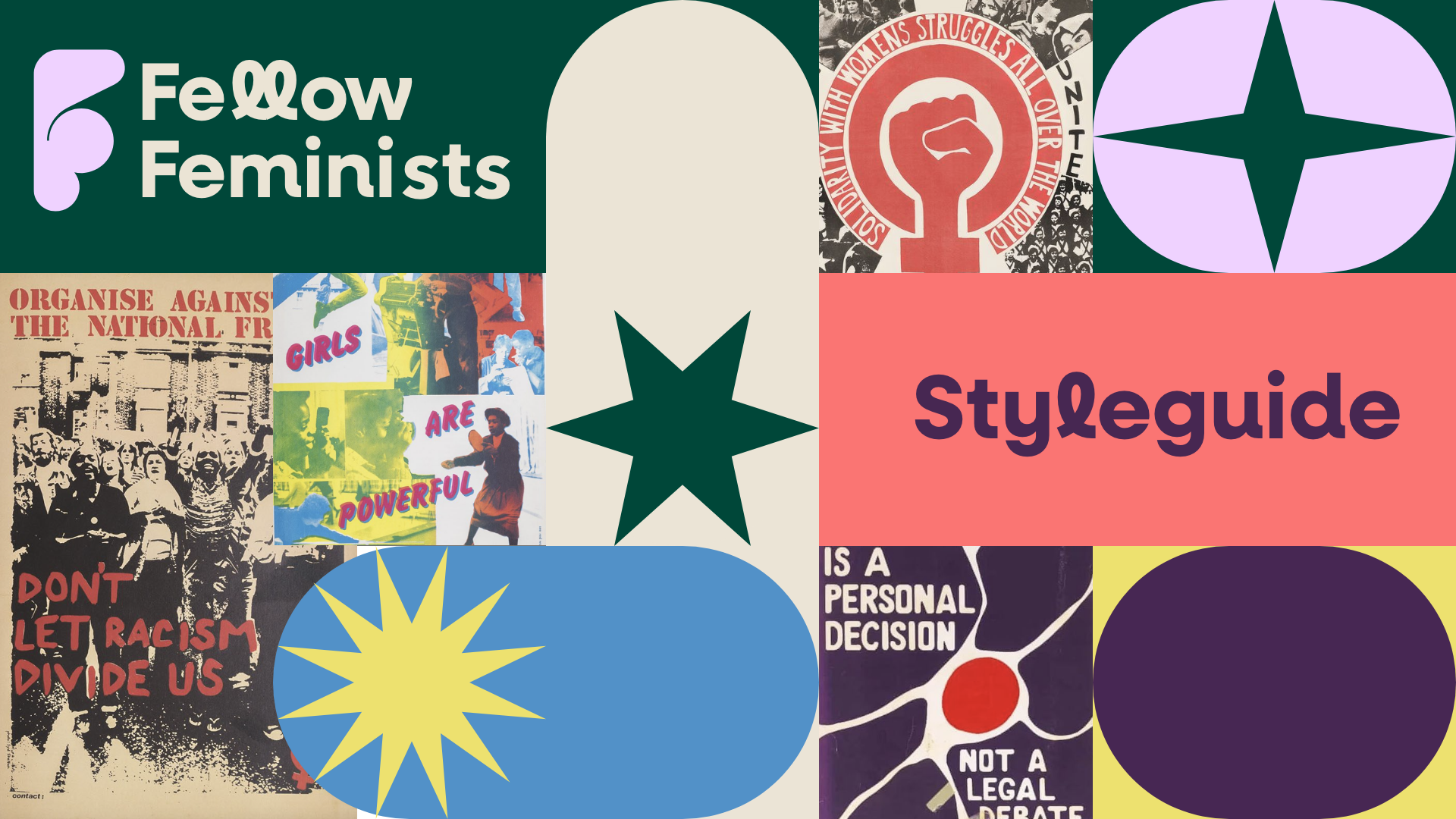
The color palette is distilled from feminist posters from the 1970s and 1980s. The second wave of feminism not only brought many rights but also left behind a rich legacy of visual art. As a nod to those who came before us, the colors in the visual identity are derived from printed posters and placards from that era. Because print colors—often produced with techniques such as risograph printing—cannot be perfectly reproduced in digital formats, the palette used here is an approximation.
TEXT
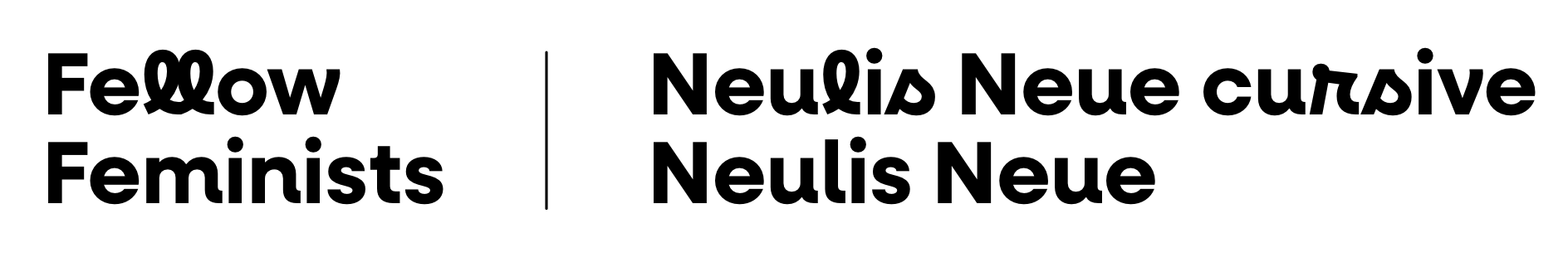
Fellow Feminists uses Neulis Neue and Neulis Cursive to balance clarity with personality. Neulis Neue functions as the primary typeface. It’s readable and bold. The font reads well across different scales and supports the initiative’s goal of making complex discussions around feminism approachable and inclusive.
To complement this, Neulis Cursive is used selectively as an expressive accent. The cursive style introduces a human, handwritten quality that softens the system and references the tradition of activist posters, zines, and hand-made protest graphics. In the identity, it functions as a visual gesture: highlighting words, adding emphasis, or introducing moments of warmth and personality within otherwise structured layouts.